11 Visualize
11.1 Prerequisites
In this chapter, you will use the eplusr package to interface with EnergyPlus via R, the tidyverse package to manipulate the simulation results, and the here package to specify relative file paths.
Additionally, we will introduce ggplot2, an input-tidy visualization package
that is based on the the grammar of graphics [8]. We will
also introduce {RColorBrewer} and viridis package that contains predefined
color palettes that make it easy to pick the right one when creating graphics in
R.
We will also be working with the following R packages in this chapter.
In this chapter, you will also be working with the U.S. Department of Energy (DOE) Commercial Reference Building for medium office energy model [3] and the third and latest typical meteorological (TMY3) weather data for Chicago. You will first parse the IDf and EPW to R and run the simulation to extract the simulation results.
path_idf <- here("data", "idf", "RefBldgMediumOfficeNew2004_Chicago.idf")
model <- read_idf(path_idf)

path_epw <- here("data", "epw", "USA_IL_Chicago-OHare.Intl.AP.725300_TMY3.epw")
epw <- read_epw(path_epw)

job <- model$run(weather = epw, dir = tempdir())
## ExpandObjects Started.
## No expanded file generated.
## ExpandObjects Finished. Time:     0.053
## EnergyPlus Starting
## EnergyPlus, Version 9.4.0-998c4b761e, YMD=2023.03.09 00:27
## Could not find platform independent libraries <prefix>
## Could not find platform dependent libraries <exec_prefix>
## Consider setting $PYTHONHOME to <prefix>[:<exec_prefix>]
##
## Initializing Response Factors
## Calculating CTFs for "STEEL FRAME NON-RES EXT WALL"
## Calculating CTFs for "IEAD NON-RES ROOF"
## Calculating CTFs for "EXT-SLAB"
## Calculating CTFs for "INT-WALLS"
## Calculating CTFs for "INT-FLOOR-TOPSIDE"
....
11.2 Colors
Choosing the right color scheme is an important aspect of data visualization because of the effects they might have on our relative visual perception of luminance. To find out more, I recommend reading Chapter 1 of Data Visualization: A practical introduction by Kieran Healy [9] that discusses aspects of perception and interpretation when creating graphics.
Fortunately, R has many pre-defined color palettes where careful thought has
been put into their perception and aesthetic qualities. Specifically, the
{RColorBrewer} package contains color palettes that have been carefully
designed for discrete data.
The {RColorBrewer} package provide three types of color palettes: sequential,
diverging, and qualitative. You can view those palettes that are colorblind
friendly.
display.brewer.all(colorblindFriendly = TRUE)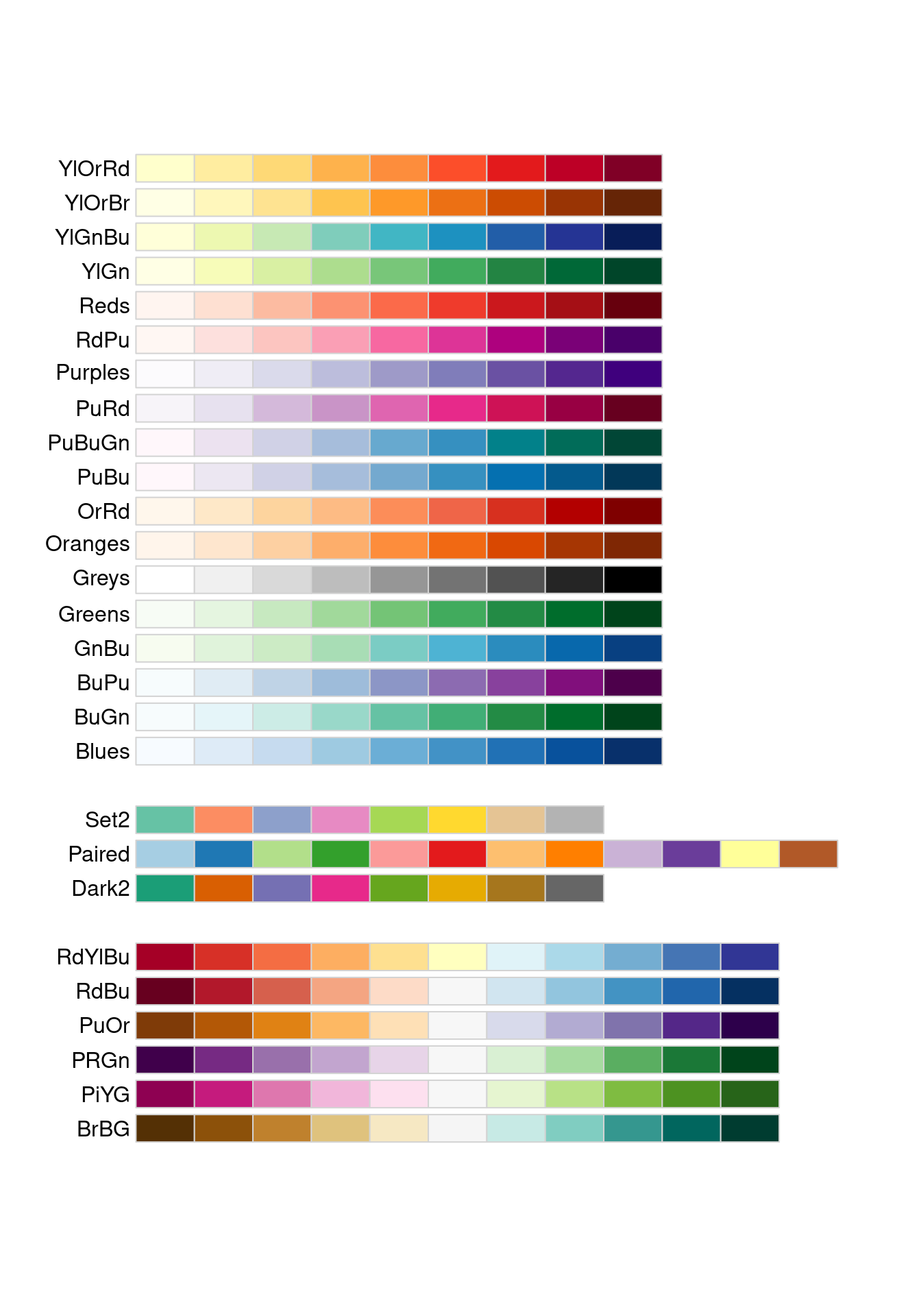
When representing gradients (such as temperature data), you want to use sequential color palletes that are perceptually uniform as the color progresses from low to high.
display.brewer.all(type="seq", colorblindFriendly=TRUE)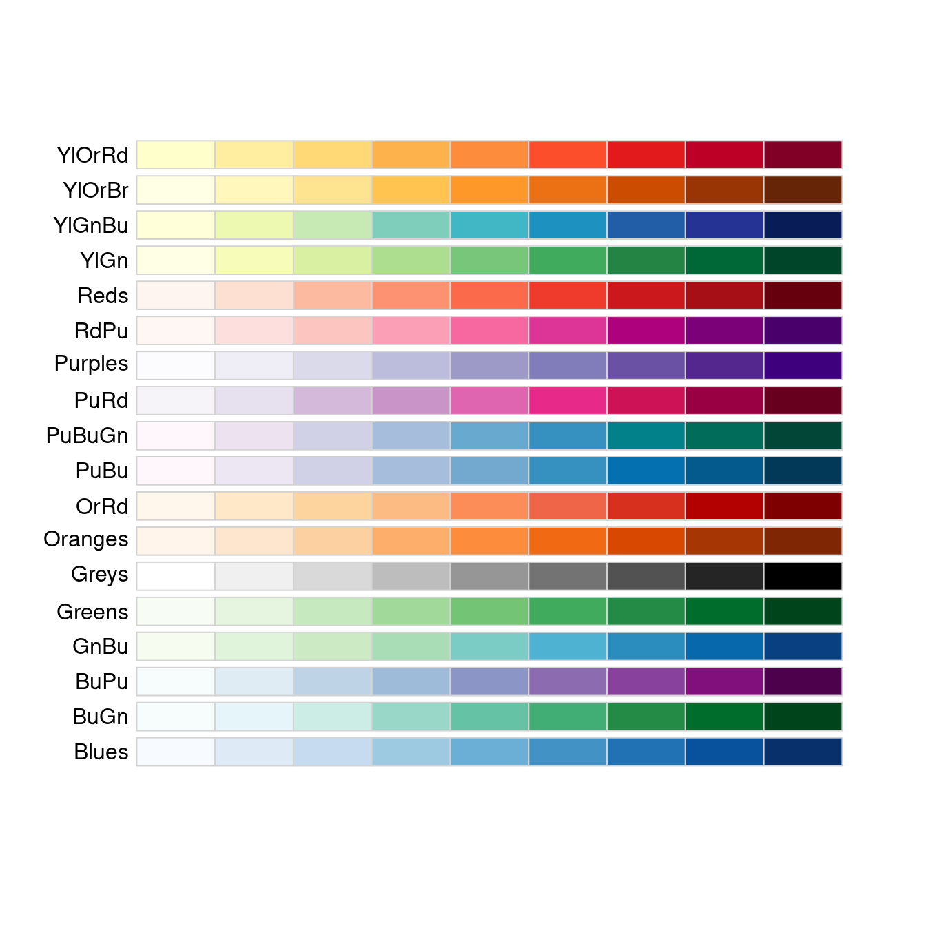
You will want to use diverging color palettes that uses a neutral mid-point
that diverges at perceptually equal steps to both ends of the data. An example
is using the RdBu color pallette to represent temperature data that diverges
between cold and hot.
display.brewer.all(type="div", colorblindFriendly=TRUE)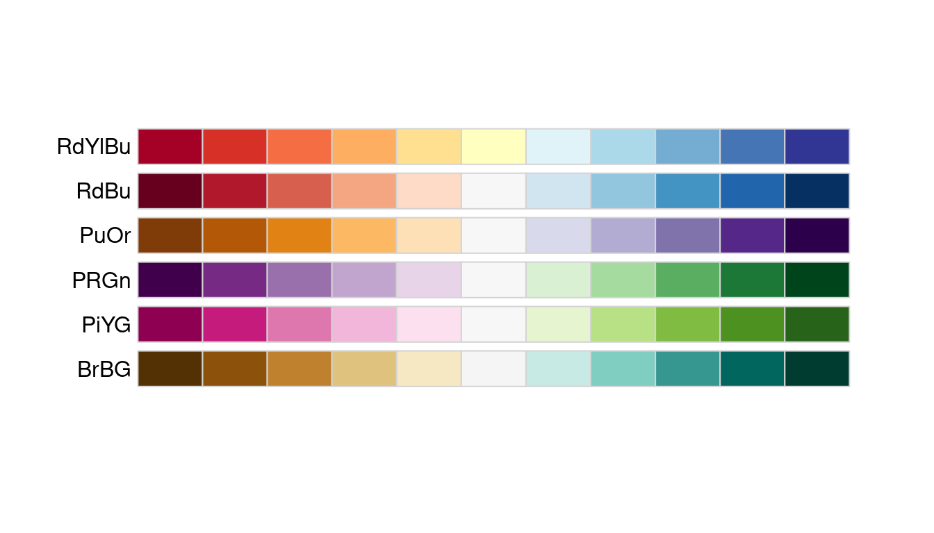
You will want to map categorical variables to qualitative color palettes that are perceptually uniform and not have any variables standing out perceptually due to it’s color. For instance, when visualizing the energy usage intensity of different buildings, you would want the colors used to represent each building to be easily distinguishable but at the same time not have one stand out from another even though they are numerically equivalent.
display.brewer.all(type="qual", colorblindFriendly=TRUE) 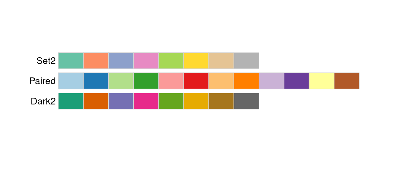
You can use the function display.brewer.pal() to visualize a single brewer
palette and use the brewer.pal() function to obtain the hexadecimade color
code of the palette.
# display 5 colors from the "Set2" color palette
display.brewer.pal(5, "Set2")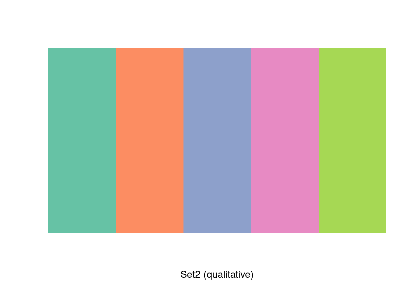
# return the hexadecimal code for 5 olors of the "Set2" palette
brewer.pal(5, "Set2")
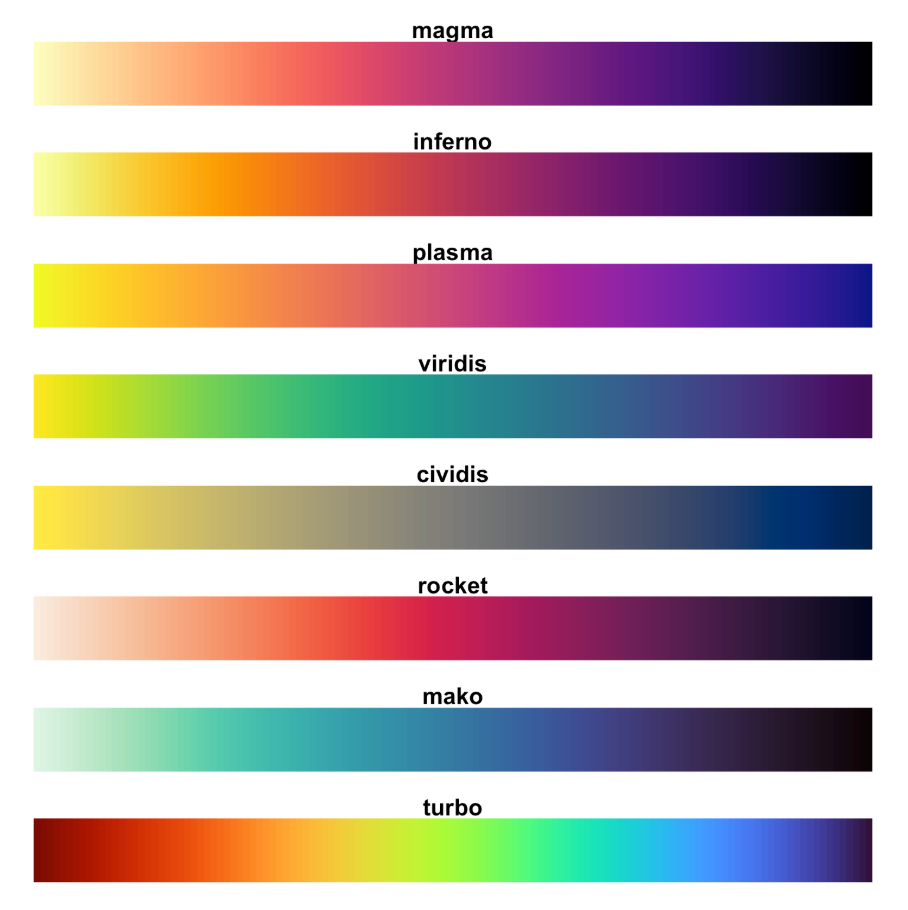
## [1] "#66C2A5" "#FC8D62" "#8DA0CB" "#E78AC3" "#A6D854"Visualizing building related data such as electricity consumption often involves mapping continuous data onto the color or fill of the graphic you want to create. Although the brewer palettes can be extended to continuous data through interpololation, I have found the color scales in the viridis package to be more robust because they are designed to be perceptually uniform while maintaining a large range. The viridis package contains eight different color scales with the viridis scale forming the default or primary color map.
11.3 ggplot()
11.3.1 Functions and Components
All plots created by ggplot2 begins with a ggplot() function that
initializes a ggplot plot object that can be used to specify how variables in
the data are mapped to the “aesthetics” of the visualization. The function has
two key arguements. The first argument data is the data frame that will be
used for the plot. The second argument mapping is used to specify how
variables in the data are mapped to the “aesthetics” of the visualization. The
function aes() is a quoting function (i.e., the inputs are evaluated in the
context of the data). This means that you can name the variables of the data
frame directly within the aes() function.
ggplot(data = <DATA>, mapping = aes(<x, y, ...>))You can then specify the graph by adding one or more of the following components
with +
- A layer that comprises of geometric objects or geom, statistical
transformation or stat, and position adjustments. Typically, a layer will
be created using a
geom_<function>() - scales that map data values to visual properties such as color, fill, shape, and size.
- A coordinate system that specifies how the coordinates of the data maps to the plot. Typically, Cartesian coordinates are used. However, other coordinate systems includes polar coordinates and map projections.
- facets that divides the data into subsets based on one or more discrete variables. These subsets of data are then displayed as subplots on the plot.
- A theme that can be used to customize the non-data components of the plot such as titles, labels, fonts, background, gridlines, and legends.
ggplot(data = <DATA>, mapping = aes(<x, y, ...>)) +
    <GEOM_FUNCTION>(stat = <STAT>, position = <POSITION>) +
    <COORD_FUNCTION>(...) +
    <SCALE_FUNCTION>(...) +
    <FACET_FUNCTION>(...) +
    <THEME_FUNCTION>(...)
You will see the use of ggplot() and the above mentioned components more
concretely as we go through the visualization recipes in the subsequent
sections.
11.3.2 Visualize end use
Bar graphs are a common way to visualize building simulation end use data. In
this section, we will illustrate the use of ggplot and its various components
using using the report_end_use data frame that was created in the preceding
section.
report <- job$tabular_data()

report_end_use <- report %>%
    filter(table_name == "End Uses",
           grepl("Electricity|Natural Gas", column_name, ignore.case = TRUE),
           !grepl("total", row_name, ignore.case = TRUE)) %>%
    mutate(value = as.numeric(value)*277.778,
           units = "kWh") %>%
    select(row_name, column_name, units, value) %>%
    rename(category = row_name, fuel = column_name) %>%
    arrange(desc(value)) %>%
    drop_na()
You can create bar graphs by adding geom_bar(). By default, stat = bin in
geom_bar() which gives the count in each x. However, when the data contains
y values, you would want to use stat = "identity".
ggplot(data = report_end_use, aes(x = category, y = value, fill = fuel)) +
    geom_bar(stat="identity")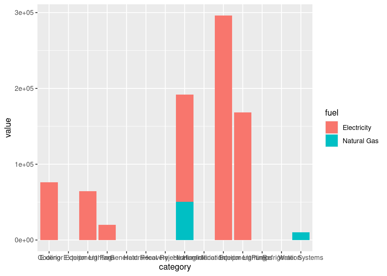
By default, the bar charts would be stacked. In this scenario, we only have two
groups of fuel, electricity and natural gas. However, when there are many
groups, stacked bar charts can be difficult to visualize. You can place them
side by side instead using position = position_dodge().
ggplot(data = report_end_use, aes(x = category, y = value, fill = fuel)) +
    geom_bar(stat="identity", position = position_dodge())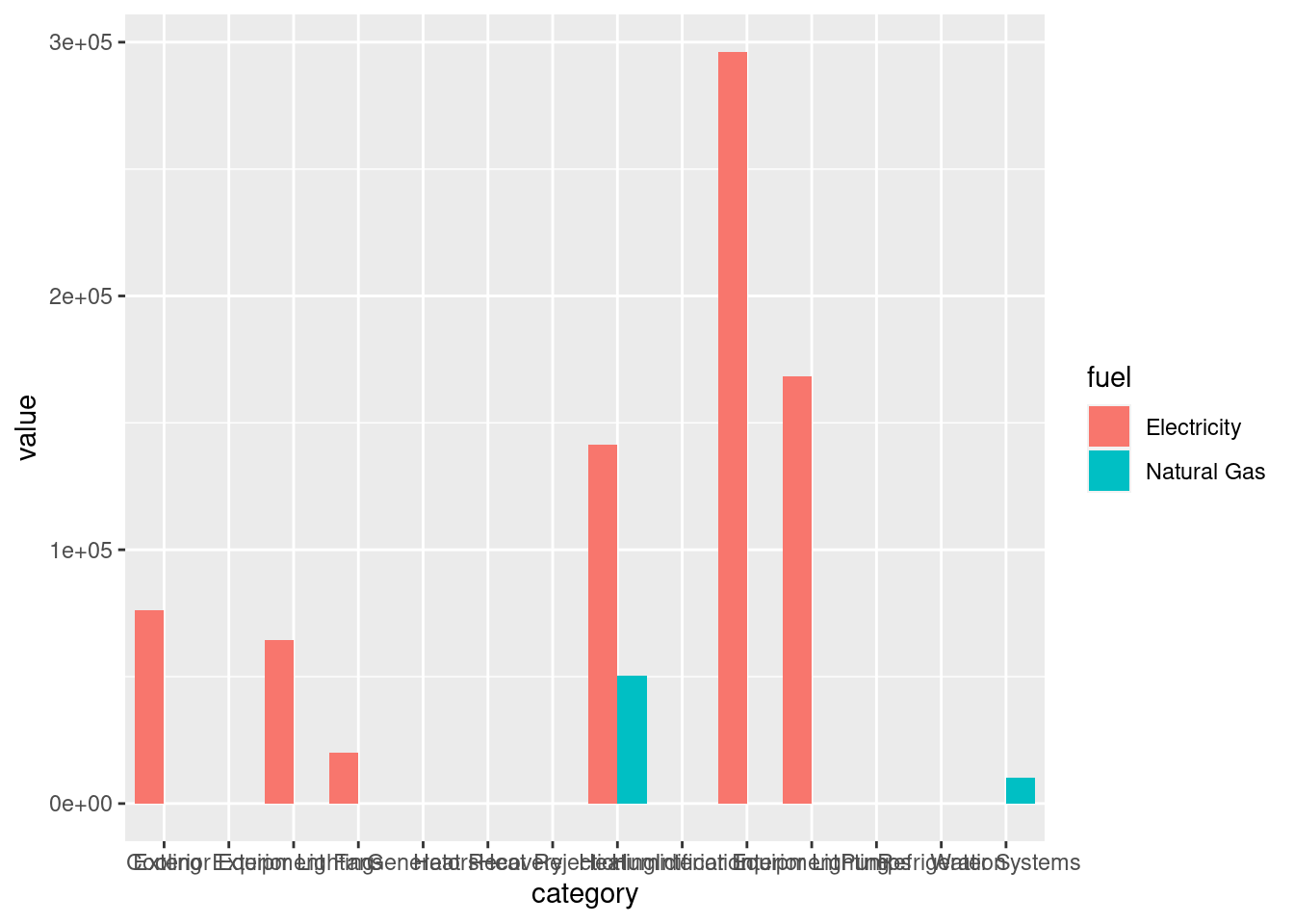
You can use scale to change the fill and colors of the bar chart. The
scale_*_brewer() and scale_*_viridis() functions provides an easy way to
specify palettes from the {RColorBrewer} and the viridis package
respectively. Particularly, scale_fill_brewer() and scale_fill_viridis()
provides mapping to ggplot’s fill aesthetics while scale_color_brewer() and
scale_color_viridis() provides mapping to ggplot’s color aesthetics.
ggplot(data = report_end_use, aes(x = category, y = value, fill = fuel)) +
    geom_bar(stat="identity") +
    # use palette argument to indicate the brewer palette to use
scale_fill_brewer(palette = "Set2") 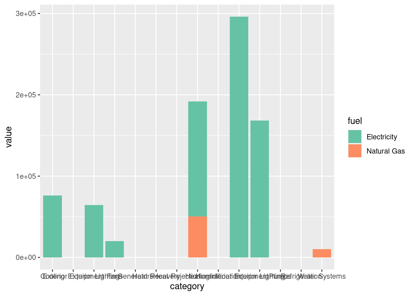
ggplot(data = report_end_use, aes(x = category, y = value, fill = fuel)) +
    geom_bar(stat="identity") +
    # use option argument to indicate the color scale to use
    scale_fill_viridis(option = "cividis",
discrete = TRUE) 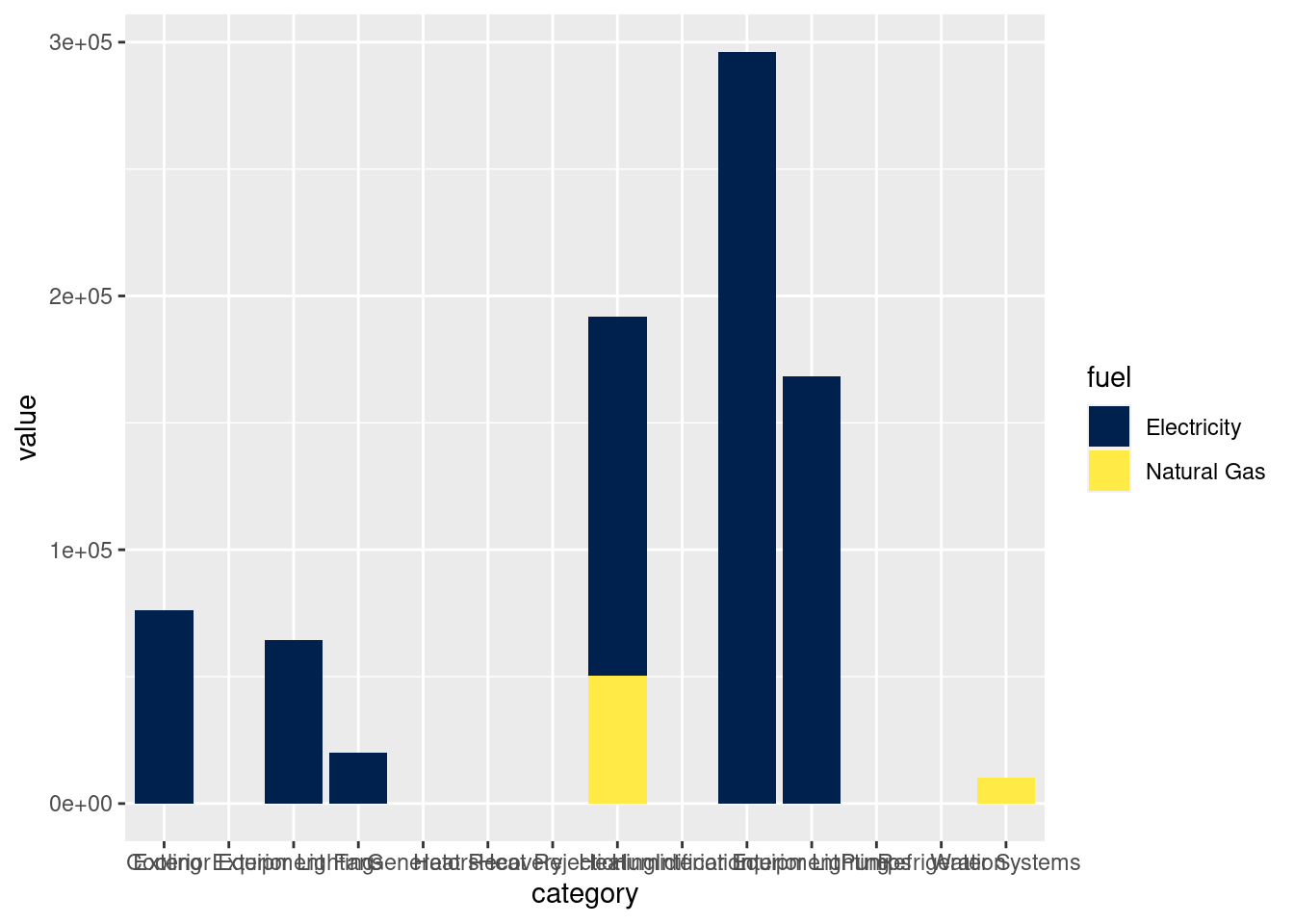
You can flip how the data coordinates maps to plot to get horizontal bar plots
with coord_filp().
ggplot(data = report_end_use, aes(x = category, y = value, fill = fuel)) +
    geom_bar(stat="identity", position = position_dodge()) +
    scale_fill_brewer(palette = "Set2") +
    coord_flip()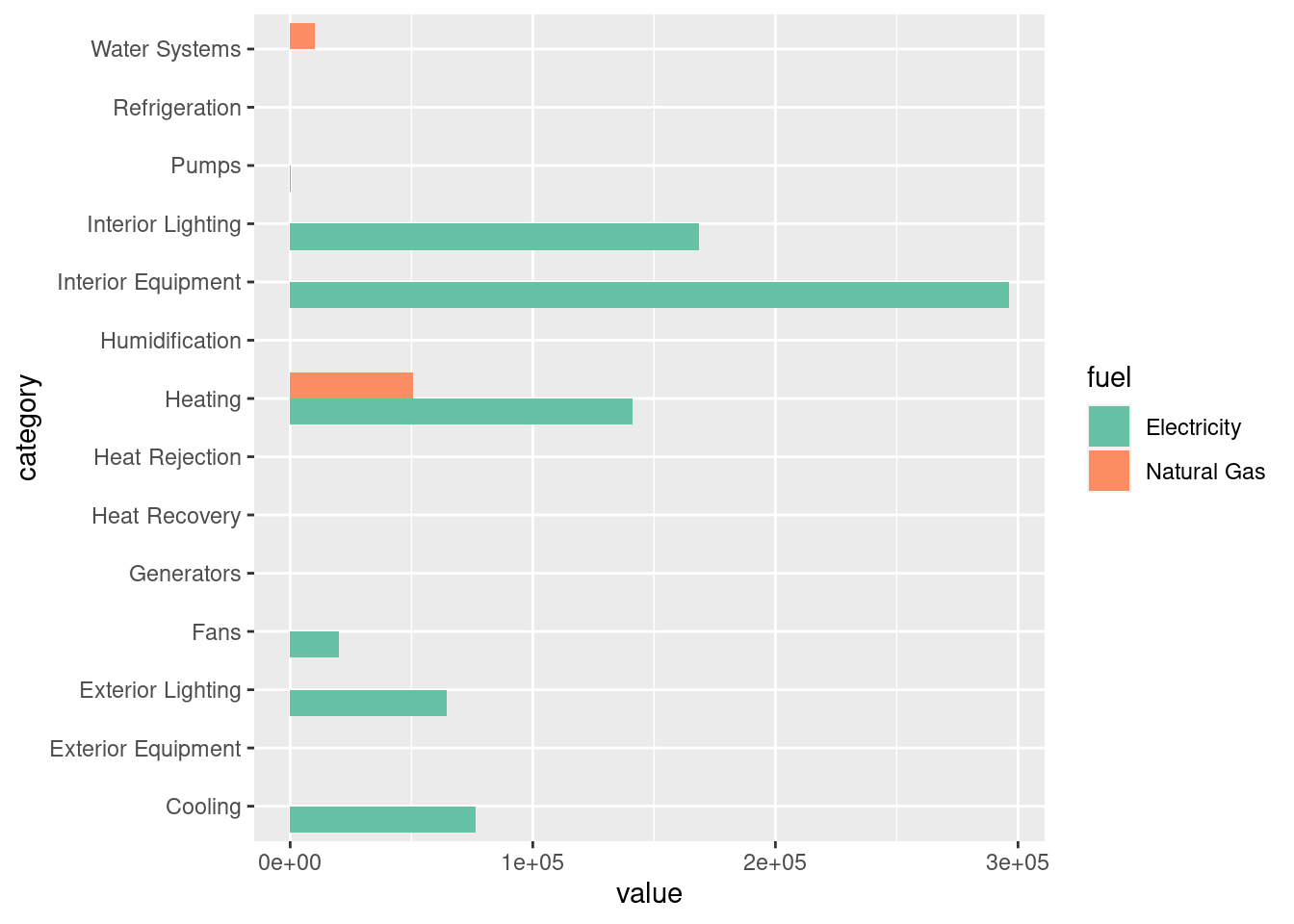
You can divide the plot into various facets by subsetting the plot based one
or more discrete variables. In this example, we divide the plot row wise based
on fuel type using facet_grid().
ggplot(data = report_end_use, aes(x = category, y = value)) +
    geom_bar(stat="identity", position = position_dodge()) +
    coord_flip() +
    facet_grid(rows = vars(fuel))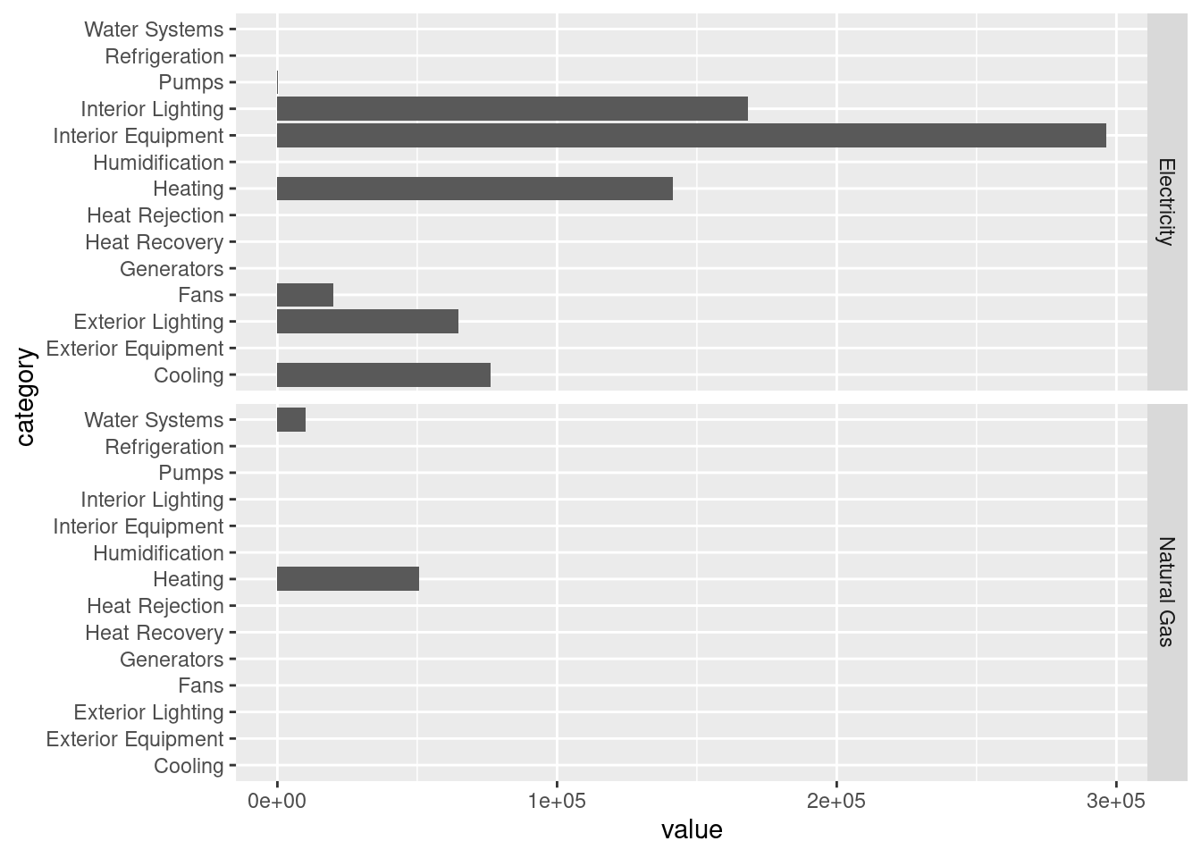
As you probably have noticed. The x-axis labels are not legible due to overlapping when plotting the data as vertical bar charts.
You can use theme() and element_text() to change how the x-axis labels
appear. In this case we are rotating it counter-clockwise by 90 degrees
(angle = 90), vertically center justify the text (vjust = 0.5), and
horizontally right justify the text (hjust = 1). For vjust and hjust, 0
and 1 refers to left and right justify respectively.
ggplot(data = report_end_use, aes(x = category, y = value, fill = fuel)) +
    geom_bar(stat="identity") +
    scale_fill_brewer(palette = "Set2") +
    theme(axis.text.x = element_text(angle = 90, vjust = 0.5, hjust=1))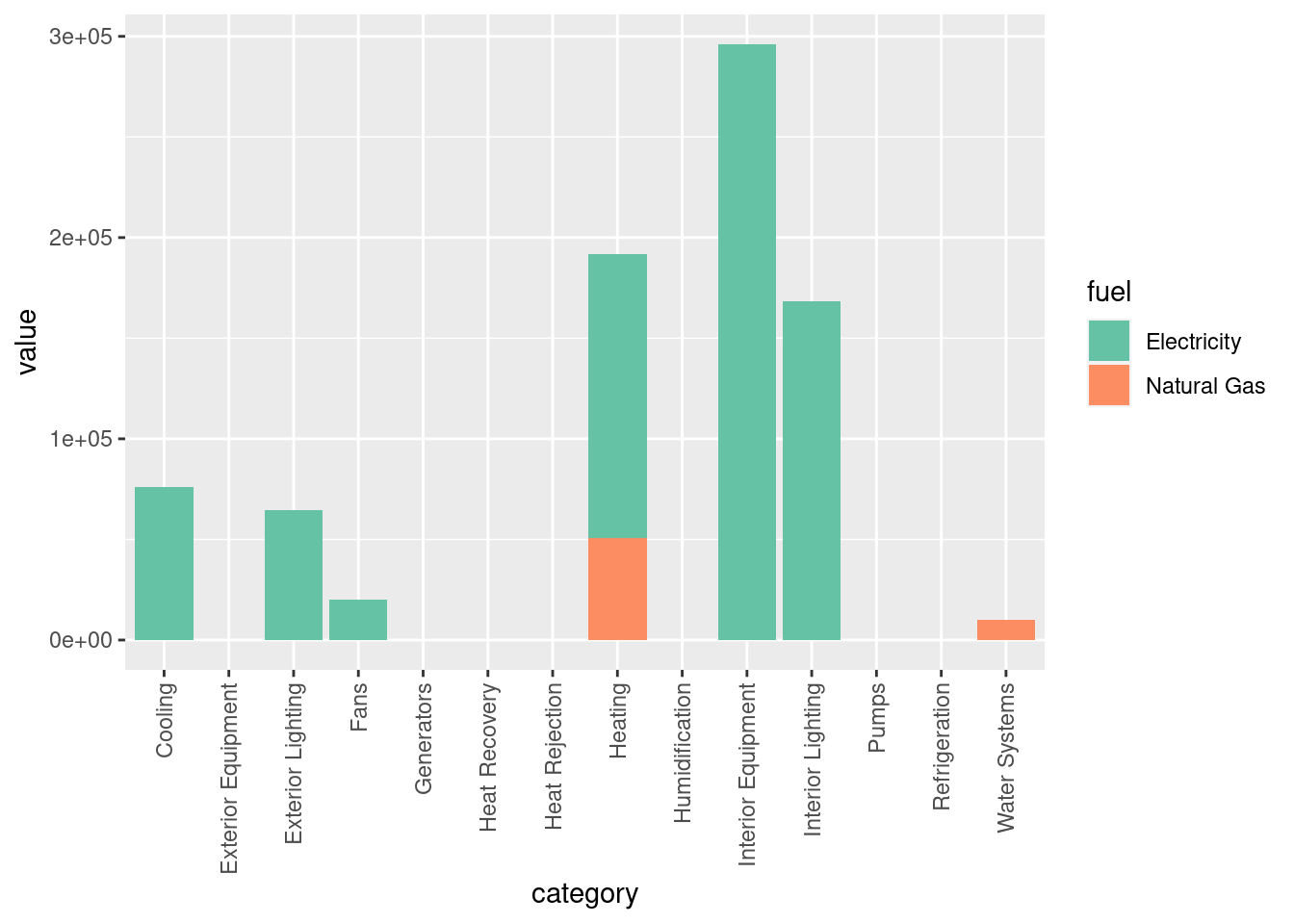
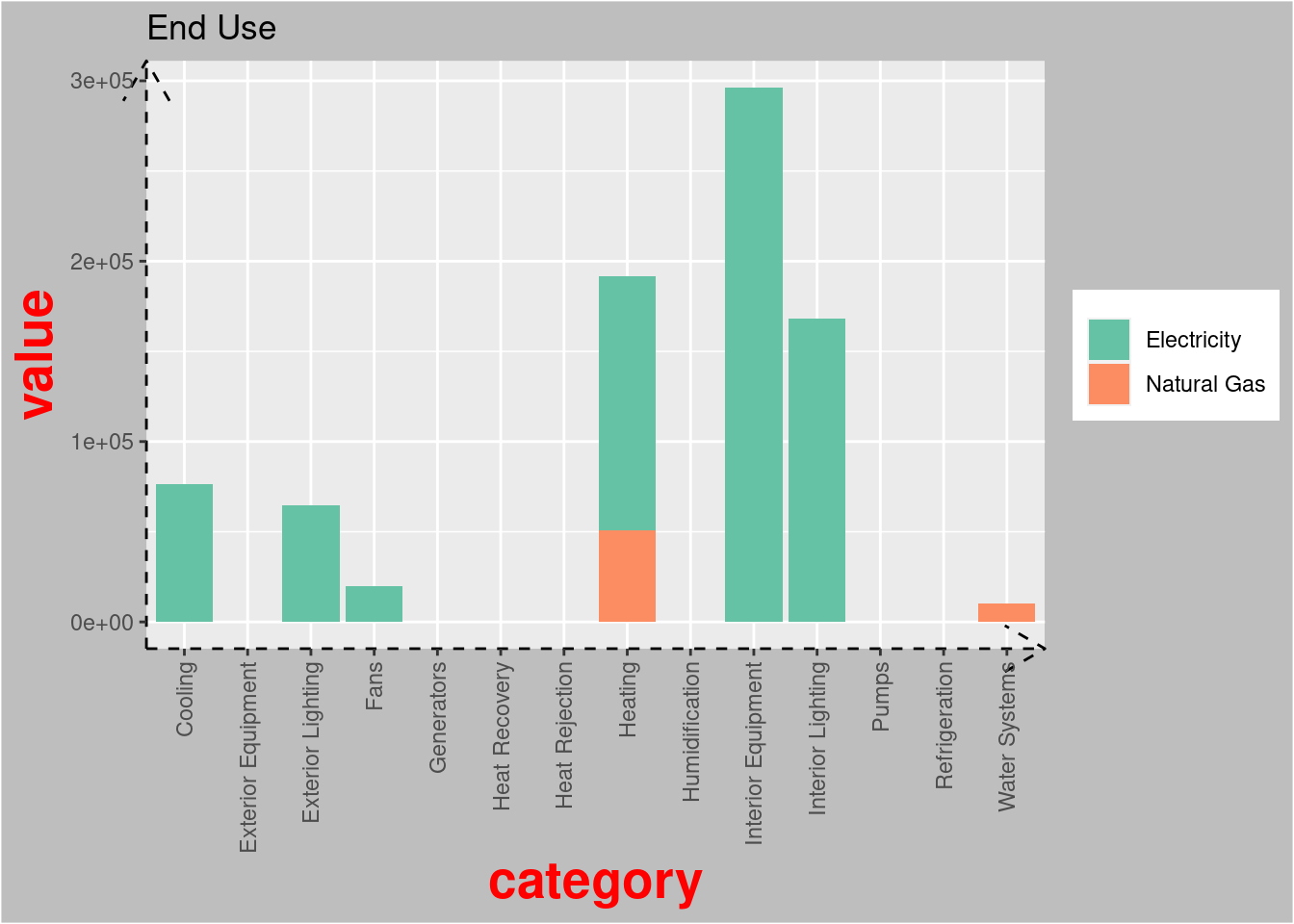
You can also use theme() together with various element_* functions to
control elements of the plot title, legend, axis labels, borders, background,
etc. You can find out more about the possible arguments to each
element_function() by typing ?margin into your console. element_*
functions are used with theme() to specify the non-data components of the
plot. There are four element functions and they are:
-
element_blank(): to assign a blank -
element_rect(): for specifying borders and background -
element_line(): for specifying lines -
element_text(): for specifying text
ggplot(data = report_end_use, aes(x = category, y = value, fill = fuel)) +
    geom_bar(stat="identity") +
    scale_fill_brewer(palette = "Set2") +
    ggtitle("End Use") +
    theme(axis.text.x = element_text(angle = 90, vjust = 0.5, hjust=1),
          axis.title = element_text(face = "bold",
                                    colour = "red",
                                    size = 20),
          axis.line = element_line(linetype = "dashed",
                                   arrow = arrow()),
          plot.background = element_rect(fill = "grey"),
          legend.title = element_blank() # remove legend title
   )
11.3.3 Visualize weather data
Weather is a critical input to building energy simulation because it form the boundary conditions of the simulation. Weather for an EnergyPlus simulation comes in an EnergyPlus Weather (EPW) format and often contains 8760 hours (or 8784 hours for a leap year) of weather data. Therefore, being able to visualize weather data is an important component when exploring building energy simulation data.
Here, we demonstrate three useful graphics for visualizing weather data using outdoor dry bulb temperature as an example.
Before creating the graphics using ggplot, we need to first extract the weather
data, which we can easily carry out using the $data() method since we have
earlier parsed the EPW file into RStudio as an Epw object.
class(epw$data())
## [1] "data.table" "data.frame"
head(epw$data())
##               datetime year month day hour minute
## 1: 2023-01-01 01:00:00 1986     1   1    1      0
## 2: 2023-01-01 02:00:00 1986     1   1    2      0
## 3: 2023-01-01 03:00:00 1986     1   1    3      0
## 4: 2023-01-01 04:00:00 1986     1   1    4      0
## 5: 2023-01-01 05:00:00 1986     1   1    5      0
## 6: 2023-01-01 06:00:00 1986     1   1    6      0
##                                           data_source dry_bulb_temperature
## 1: ?9?9?9?9E0?9?9?9?9?9?9?9?9?9?9?9?9?9?9*_*9*9*9*9*9                -12.2
## 2: ?9?9?9?9E0?9?9?9?9?9?9?9?9?9?9?9?9?9?9*_*9*9*9*9*9                -11.7
....
weather_data <- epw$data() %>%
    select(datetime, dry_bulb_temperature) %>%
    mutate(month = month(datetime, label = TRUE),
           day = day(datetime),
           wday = wday(datetime, label = TRUE),
           hour = hour(datetime))
In the subsequent graphics, we will be using various colors from the Reds
color palette from RColorBrewer.
# return the hexadecimal code for 5 olors of the "Set2" palette
brewer.pal(8, "Reds")
## [1] "#FFF5F0" "#FEE0D2" "#FCBBA1" "#FC9272" "#FB6A4A" "#EF3B2C" "#CB181D"
## [8] "#99000D"
display.brewer.pal(8, "Reds")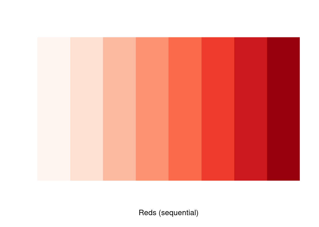
You can visualize the weather data (dry bulb temperature in this example) as a
single time series plot. Here, geom_line() is used to connect the observations
sequentially over time. expression() is used to express the degree symbol in
the y-axis label.
ggplot(weather_data, aes(x = datetime, y = dry_bulb_temperature)) +
    geom_line(color = "#FB6A4A") +
    xlab("Time (Hours)") +
    ylab(expression("Dry bulb temperature " ( degree*C)))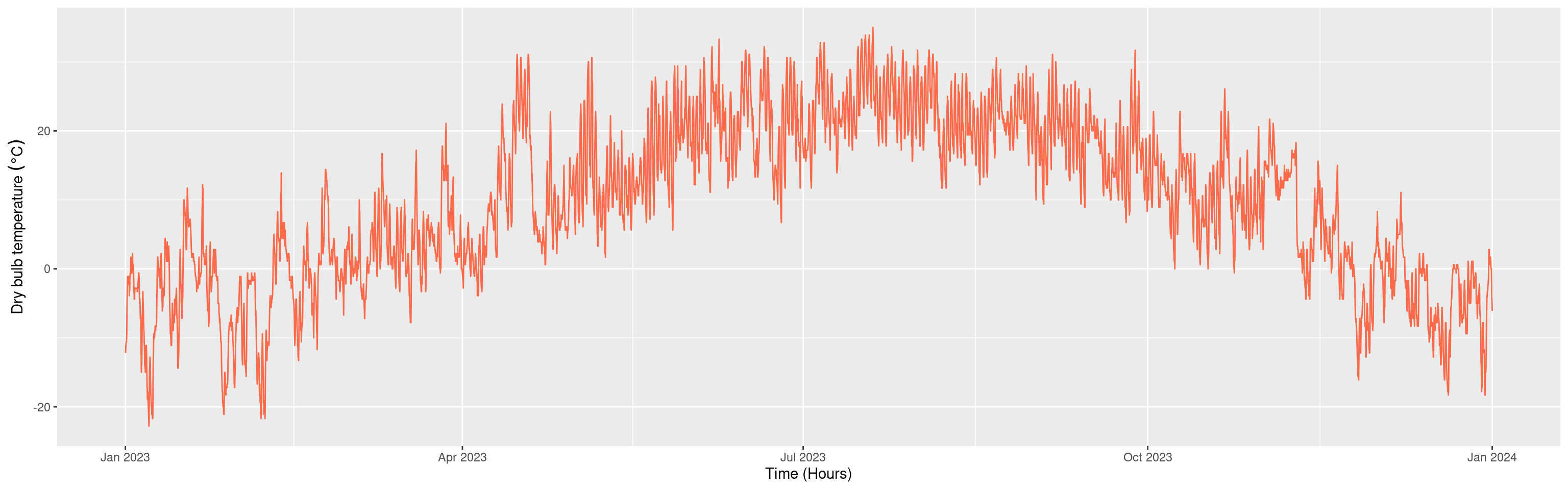
You can also visualize the data by the hour of the day using scatterplots. To
avoid overplotting, a typical problem with scatterplots, you can subset the data
by their month using facet_grid(). To further aid the ability to visually
identify patterns in the presence of overplotting, you can use geom_smooth()
to add a smoothed line on top of the scatterplot.
ggplot(weather_data, aes(x= hour, y = dry_bulb_temperature)) +
    geom_point(color = "#FCBBA1", alpha = 0.7, size = 0.5) +
    geom_smooth(color = "#EF3B2C") +
    facet_grid(cols = vars(month)) +
    xlab("Hour of the day") +
    ylab(expression("Dry bulb temperature " ( degree*C)))
## `geom_smooth()` using method = 'loess' and formula 'y ~ x'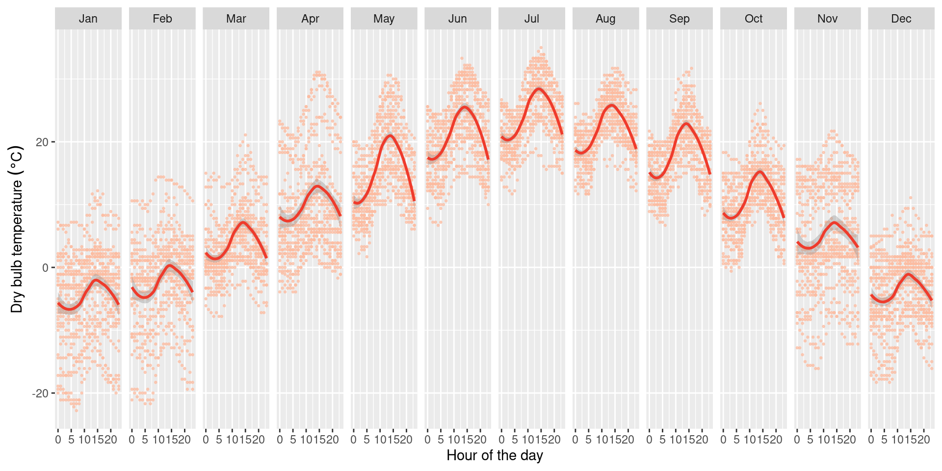
Last but not least, you can create heatmaps using the function geom_tile().
ggplot(weather_data, aes(x = day, y = hour, fill = dry_bulb_temperature)) +
    geom_tile() +
    scale_fill_viridis(name = expression(degree*C),
                       option = "plasma") +
    facet_grid(cols = vars(month)) +
    ylab("Hour of the day") +
xlab("Day of the week") 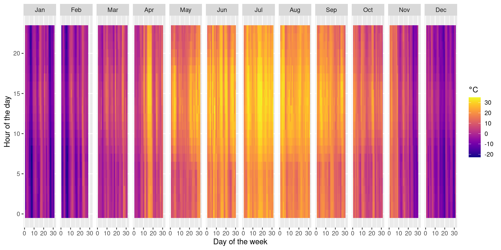
11.3.4 Saving Plots
You can use the ggsave() function to save the plot. By default, it saves the
last plot that was displayed. You can specify the size of the graphic using the
units (“in”, “cm”, “mm”, or “px”), width and height argument.